ARIA – Going Beyond HTML
I like HTML. I really do! It’s an astonishingly expressive language, allowing me to mark my content correctly. I mean, it is a markup language after all. There are at least 112 HTML elements out there, each with its own unique meaning. The <p> one? It’s a paragraph. <img> is for images. And we can’t forget about our interactive friends, <a> (links) and <button> (well, buttons)!
But even with having so many options, there are still some complicated things that can’t be expressed with HTML alone. There are no HTML elements for menubars, context menus, dropdowns, toggle buttons… That’s why there are situations where we need to go beyond HTML and ARIA could help us with that!
What is ARIA?
According to Wikipedia, an aria is “a self-contained piece for one voice, with or without instrumental or orchestral accompaniment, normally part of a larger work.” Ooops, not that one.
ARIA is an acronym for Accessible Rich Internet Applications. Formally, it’s called WAI-ARIA (Web Accessibility Initiative – Accessible Rich Internet Applications), and it’s an open web standard developed by the World Wide Web Consortium (W3C). The ARIA specification is constantly updated, and changes are propagated to browsers and assistive technologies.
The main role of ARIA is to help express things that are not expressible by HTML. It’s achieved through two mechanisms:
Both of these mechanisms are available in HTML as attributes (e.g., the role can be set on the element using the role attribute, while states and properties are set via the attributes prefixed with aria-). Thanks to them, we can create many complex patterns (menubars, toolbars, interactive grids, etc.) but also some less complex ones, like a heading of level 5:
<p role=”heading” aria-level=”5”>I am a heading.</p>Why do we need ARIA?
But why do we even need the ability to express complex patterns in HTML? Can’t we simply put several HTML elements together to look like a menubar and call it a day? Well, we can – but the experience created won’t be accessible.
People using assistive technologies (like screen readers) often use browsers only with these technologies. In many cases, they can’t rely on their sight and need to trust the technology to relate what is shown in their browser.
That’s why visual-only solutions are not enough – they exclude many people. According to WHO, 2.5 billion people worldwide need some sort of assistive technology, including (but not limited to) people with disabilities. Using ARIA to correctly mark up complex patterns on websites is one of the most fundamental ways to accommodate the needs of this audience.
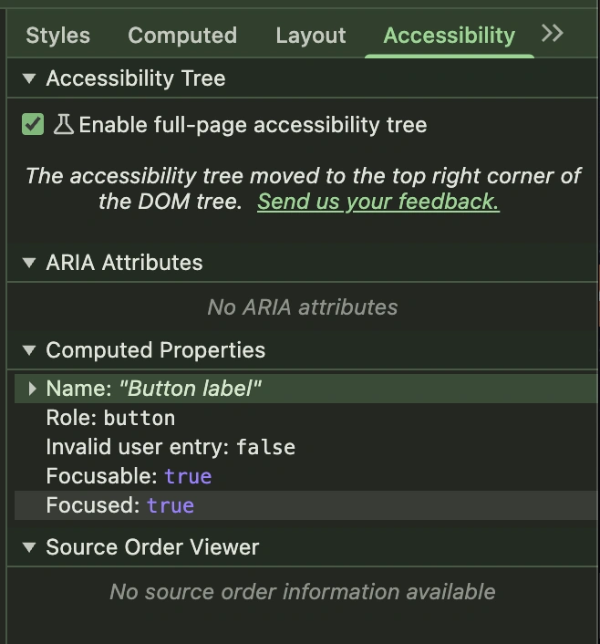
Some types of assistive technology, like screen readers or voice control, communicate with the browser using a so-called accessibility tree. Browsers love trees – they create several of them during parsing and rendering the page. The accessibility tree is one of these. It’s quite similar to the DOM, as it’s also based on HTML elements, but it contains information about how each node is then presented to assistive technologies:
-
What the element’s role is
-
What its accessible name is
-
What its state is, etc.
Let’s look at a simple button:
<button>Button label</button>The DOM tree will tell us that it’s a button. The accessibility tree, on the other hand, will tell us that it’s a button named Button label, it’s focusable, and, if we’ve just interacted with it, it’s focused. The accessibility tree can be inspected in the browser’s devtools, e.g., Chrome’s or Firefox’s.
But sometimes we need to express something that is beyond the capabilities of HTML – and that’s when ARIA comes to the rescue! It allows overwriting the existing element’s role and properties. Thanks to that, these elements will be correctly represented in the accessibility tree.
However, implementing ARIA properly can be a bit tricky, so in the following paragraphs we’ll take a closer look at how and how not to use it.
How not to use ARIA?
Let’s look once more at the example shown above:
<p role=”heading” aria-level=”5”>I am a heading.</p>Upon inspecting it with devtools, we discover that it’s still a paragraph inside the DOM tree. It’s even styled like a paragraph! At the same time, the accessibility tree claims it’s a heading of level 5. Magic! ✨
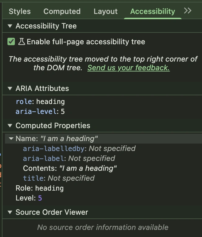
That’s a pretty straightforward example: we take a paragraph and transform it into a heading.
That’s also a pretty bad example of ARIA usage. As with everything, there are rules. And the first of them is when something can be expressed with native HTML, avoid using ARIA. So, instead of making a heading out of the paragraph, we should stick to the <h5> element.
The importance of this rule is much more visible in the case of interactive elements, like buttons. As we’ve already established, ARIA’s only superpower is changing how an HTML element is represented in the accessibility tree. But a button is much, much more than just an HTML element.
The button’s main features include:
It’s focusable
It’s clickable
It’s “clickable” via the keyboard (BTW did you know that there is a difference between activating a button with the Space key and with the Enter key?)
None of these things are covered by ARIA, but all of them are already there if we use the <button> element instead of a custom one.
How to use ARIA correctly?
So how to use ARIA correctly? There is a comprehensive guide prepared by W3C - The ARIA Authoring Practices. It contains a catalogue of patterns, like the menubar. It’s a good starting point for further research on the topic and contains not only information about the suggested markup and why it has been chosen, but also information on the recommended keyboard interaction and focus management. Using ARIA requires additional work to ensure that a control, which is represented in the accessibility tree in a particular way, also behaves as it is supposed to.
In other words, in most cases using ARIA alone will not improve the accessibility of a web application. It will make it worse. Why? Imagine you have a <div> element that claims to be a button, but it can’t receive focus or be activated using the keyboard - a horror for anyone trying to interact with it using a screen reader or voice control technology. Using ARIA makes sense only if the whole behavior layer is implemented alongside it.
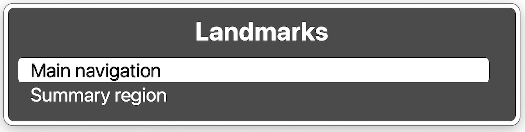
There are less complex scenarios when ARIA alone is sufficient, e.g. creating uniquely named regions:
<nav aria-label="Main">
   <ul>
       <li><a href="#">Some navigation</a></li>
   </ul>
</nav>


<section aria-label="Summary">
   <p>Here goes a summary of the article!</p>
</section>
In the above example, we create two sections: a navigation one (with the <nav> element) and another one with a summary (with the <section> element). Both of them have their unique names added using the aria-label attribute. Thanks to that, they are easily recognizable when navigating a webpage with an assistive technology, e.g., using the VoiceOver rotor:
ARIA in CKEditor 5
CKEditor 5 is a heavy user of ARIA. As a complex web application, it uses many different roles and properties. Let’s look at some of the examples.
Toggle buttons

Some editor functionalities are toggled, like bolding the text. These features are most often represented in the UI using toggle buttons: buttons that exist in one of two states at a time – off and on. We use the standard <button> elements for them with the additional aria-pressed attribute. If it’s set to true, the button is on, and if it’s set to false, the button is off.
<button aria-pressed="false">Bold</button>Menubar
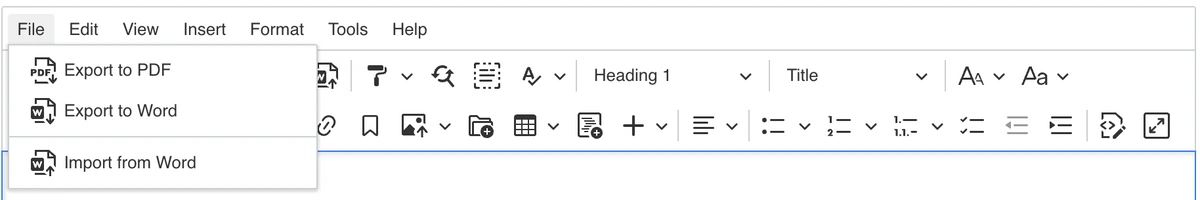
There is an option to add a menubar to CKEditor. It can be operated with the mouse but also with the keyboard. To set the focus on the menubar, you need to move the focus to the editor and then press the Option/Alt + F9 key. Then you can move through the menubar with the arrow keys and activate options with the Space bar.
In terms of ARIA roles, the menubar itself has the menubar role. Each of the main categories are marked as menuitems and each menu as menu. The menubar itself, and all of the menus, use the aria-label attribute to assign an accessible name to them:
<div aria-label="Editor menu bar" role="menubar">
 <button role="menuitem" aria-haspopup="true" aria-expanded="false">
   File
 </button>
 <ul role="menu" aria-label="File">
   <li role="presentation">
     <button role="menuitem">Export to PDF</button>
   </li>
 </ul>
</div>
The additional aria-haspopup and aria-expanded attributes on the menuitem indicates that this menu item is a menu button – a menu opens upon clicking it. The presentation role on the <li> element ensures that the structure of the accessibility tree (so the menu with menuitems as direct children) is preserved despite the DOM structure.
The editor itself
application role.The editor as a whole also uses ARIA! After all, it’s a complex application embedded right into a webpage or another application. That’s why the editor’s container uses the application role.
It also uses the aria-labelledby attribute to provide a unique name for each of the editors on the page:
<div role="application" aria-labelledby="label">
   <label id="label">Editor label</label>
</div>
The editor allows the user to customize the label.
Go beyond HTML!
And there you have it! A quick glimpse beyond HTML into an infinite - and accessible - horizon of possibilities enabled by ARIA.
But beware:
With great power comes great responsibility!Ben Parker
After all, as we described in one of the paragraphs above, no ARIA is better than bad ARIA.